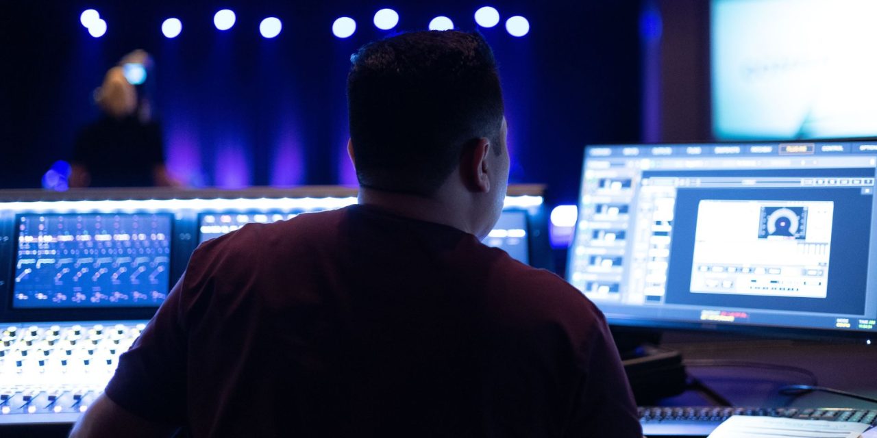
If someone in the back row is leaning forward to read the lyrics, your slides have already lost the plot. The screen may look perfectly fine from the sound booth, which is exactly where the person who designed it probably is.
A worship slide has one basic job: help people see the words well enough to sing them. This practical back-row checklist covers the essentials, from readable fonts and strong contrast to sensible line breaks, timely advances, and testing before the service. You will finish with a repeatable standard your whole team can use.
Why Back-Row Readability Is a Worship Issue, Not Just a Tech Issue
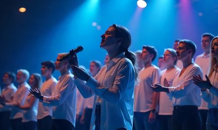
When people at the back cannot read the lyrics, their participation in worship is hindered. The problem is not unwillingness to sing, but an inability to follow the words.
Hebrews 10:24-25 (NIV) calls believers to encourage one another and continue meeting together. Corporate singing gives that encouragement a very practical expression. A room full of people can sing the same truth together because everyone can see and follow the words.
Corporate worship depends on shared words. If only the first few rows can follow the lyrics, the congregation gradually divides into those singing and those watching. The church loses the sound of many voices lifted together.
Worship leaders and media teams therefore carry a quiet pastoral responsibility. Readable lyric slides serve the person sitting in the rear pew just as much as the person near the front.
Consider who may be sitting farthest from the screen. It could be a parent managing a restless child, an older member, a visitor learning unfamiliar songs, or a volunteer arriving late after serving elsewhere. When the lyrics become difficult to read, these people can disengage first.
This does not require advanced technical knowledge. It requires remembering the purpose of church projection. The goal is not an attractive slide on a monitor. The goal is a congregation that can see, sing, and respond together.
What Makes Lyric Slides Fail for the People Farthest Away
Distance magnifies small design problems. A font that looks crisp on a laptop can become a blur from the back pew, while subtle contrast can disappear from the balcony.
Several factors contribute to this problem.
Pixel density and letter height matter more than many volunteers realize. A small font may look perfectly readable during preparation but become difficult to resolve at greater distances. As viewing distance increases, larger letterforms become increasingly important.
A practical rule of thumb used by some projection teams is roughly one inch of letter height for every 10 feet to the farthest seat. In a room where the back row sits 80 feet away, that would suggest letters around eight inches tall.
Viewing angle and sightlines create another challenge. A screen mounted high and centered may work well for middle seats but become harder to view from the sides. Sanctuary layouts, balconies, and rear pews can all change how people experience the same slide.
Environmental conditions also affect readability. Projector brightness that works in a dim room may struggle when windows or house lights increase. A subtle color combination that looks elegant during design can lose definition under actual service lighting.
Background images and motion can make the problem worse. When visual elements compete with the lyrics, the congregation has to work harder to separate words from the background.
Small details can compound the issue. Thin letter strokes, decorative fonts, crowded lines, and rapid transitions can all make following lyrics harder.
The solution begins with a simple change in perspective. Do not judge a lyric slide from the best seat in the room. Judge it from the worst.
Your team does not need to make every slide visually complicated. Larger text, clearer contrast, sensible spacing, and proper testing can make a significant difference. The deeper question is how those choices should work together as a consistent worship presentation standard.
Conclusion
Readable lyric slides may seem like a small part of a worship service, but they can determine who gets to participate fully. A beautiful presentation means little if half the room is squinting at it.
The back row gives your team the most honest feedback. If people there can comfortably see, follow, and sing the words, your slides are doing their job.
So before the next service, look beyond the control booth and check the view from the farthest seat. Your congregation should not need excellent eyesight to join the song.
How many “readable” worship slides are actually readable from the back row? DLK Praise and Worship will be digging deeper into the design choices that separate clear lyrics from Sunday-morning squinting.